

Hexbin Maps and Choropleths
Fun, new graphics

I haven’t blogged in a little while, but I’ve been working on choropleths! I hit a wall with some Mac-update related issues but luckily Randy was able to help me out and I seem to be past those.
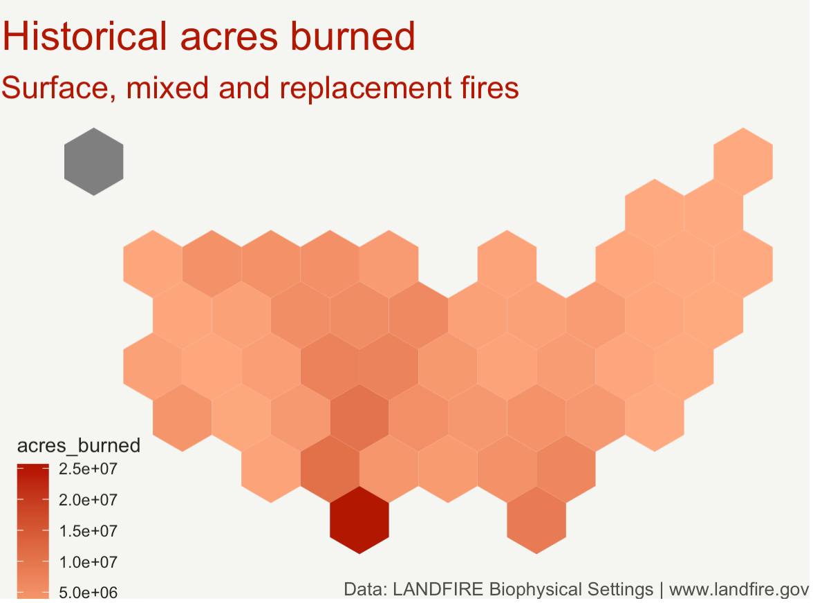
Today I made my very first (successful) choropleth, which was a hexbin map of the continental United States, using data from the LANDFIRE Team of historical fire prevalence state-by-state and the overall acres burned. I followed r graph gallery’s tutorial, which used ggplot. Here’s the rough version of my first map.
There were a couple things I couldn’t figure out:
- How to get rid of Alaska, since the shape json file that I used included all 50 states, but the LANDFIRE data only referred to the continental ones. I (sort of accidentally) hid Hawaii under the key when I was testing out different locations for it. Alaska doesn’t appear to be messing up the rest of the data, just hanging out
- How to get a better gradient. I was able to change the colors to some generic red-orange but I couldn’t figure out how to utilize r color brewer or make the gradient more meaningful-looking, since it doesn’t really show minute distinctions.
- I think I knew this and forgot, but how to get rid of scientific notation
- How to change the text from acres_burned in the key to something nicer-looking
- How to put the state names on the map! The original shape-file had state names, but they’re gone for some reason.
- This one is a little vain, but how to change the font. Not hating on Arial…
Overall, however, I feel like I was pretty successful in getting through the main obstacles. Be on the lookout for more choropleths :)


Share this post
Twitter
Google+
Facebook
Reddit
LinkedIn
StumbleUpon
Pinterest
Email